You need a landing page for a campaign, and every guide points you at a page builder and a monthly subscription. For most landing pages that is more than you need.
What those guides leave out is what makes a landing page convert rather than just exist. This one covers that first, builds the page in the block editor, then checks it before you spend on traffic.
What a landing page has to do
A landing page has one offer and one action, and it removes everything that could lead the visitor anywhere else. That is the whole definition, and it is what separates a landing page from an ordinary well-designed page.
Most pages that get called landing pages still carry the site header, the navigation menu, the sidebar and the footer. Every one of those is an exit, and a visitor who arrived from a paid ad has already been paid for. Removing the exits takes about thirty seconds and is the highest-impact thing you will do on the page, because a good landing page has one action and close to zero competing links.
Do you need a page builder?
For most landing pages you do not need one. The block editor handles a hero, a proof section, a form area and repeated buttons without any plugin, and it produces lighter markup than a builder will.
A builder earns its cost in four specific situations, and it is worth knowing them so you can tell whether you are in one.
- You are building many pages a month: a builder’s saved templates and global styles pay for themselves at volume, where a handful of pages a year will not justify it
- Your layout needs precise positioning: overlapping elements, absolute placement and fine responsive control are genuinely awkward in the block editor
- Non-technical people will edit the page: a builder’s visual editing is more forgiving for somebody who will not touch a block settings panel
- You need a popup, a countdown or A/B testing built in: several builders bundle conversion features that would otherwise be separate plugins
Outside those four, the block editor route wins on weight, and weight is the thing a landing page can least afford. A landing page carries paid traffic, paid traffic is mostly mobile, and every second the page takes to become interactive is a share of that spend you do not get back.
If you are weighing the hosted alternatives too, our Elementor vs Wix comparison covers that side of the decision.
Build a landing page with the block editor
This is the whole build with no plugin required. It works on any modern WordPress theme, and the only thing your theme needs to supply is a template without the header and footer.
Step 1: Create the page and strip the furniture
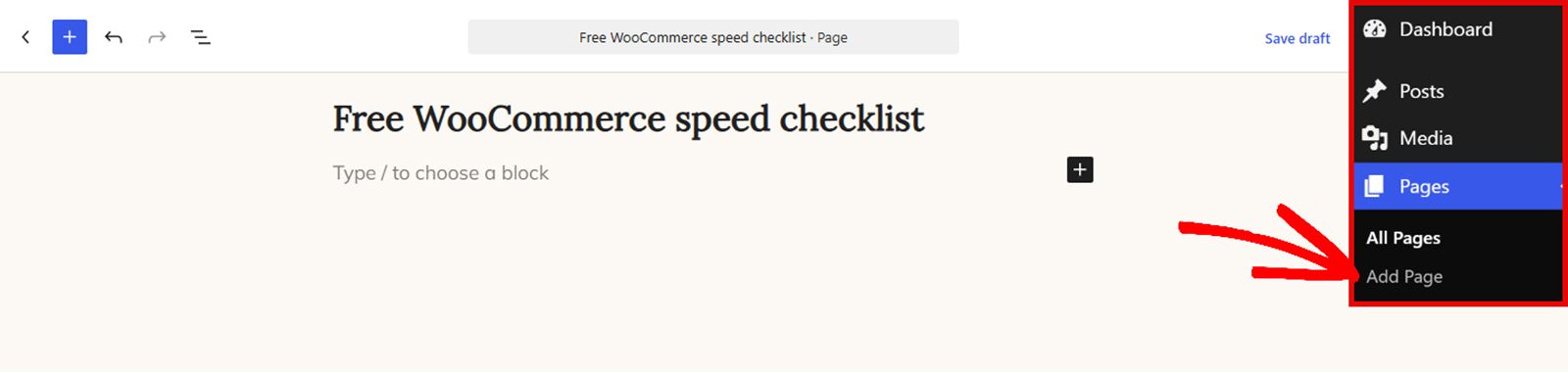
Start in Pages » Add Page, and give the page a name you will recognize in a list of thirty.
Now open the Page tab in the settings sidebar and find the Template control. Changing this setting is what turns an ordinary page into a landing page, and it is skipped in most tutorials.
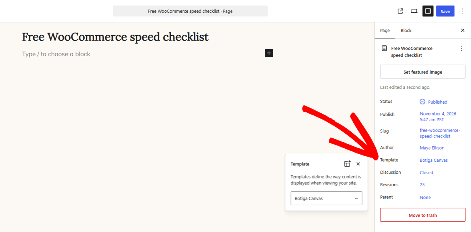
Choose a blank or full-width template, the one your theme offers without a header and footer. Names vary between themes, so look for Blank, Canvas, Full width or something similar. A light theme makes this easier, and our fastest WordPress themes comparison has the measured numbers if you are picking one for this.
On Botiga, also open Botiga Page Options under the editor and switch on Page Builder Mode. It removes the page title and the content container, so the theme does not print a second headline above your hero and every section can run edge to edge.
If your theme has no blank template, the site editor lets you create one, or you can pick the widest template available and hide the navigation menu with a few lines of CSS on this page only.
Step 2: Build the hero with one promise and one button
The hero carries the offer, so it gets one heading, one supporting line and one button between them. Anything else in here competes with your own call to action.
Open the block inserter with the + button at the top left of the editor, then search for the Cover block.
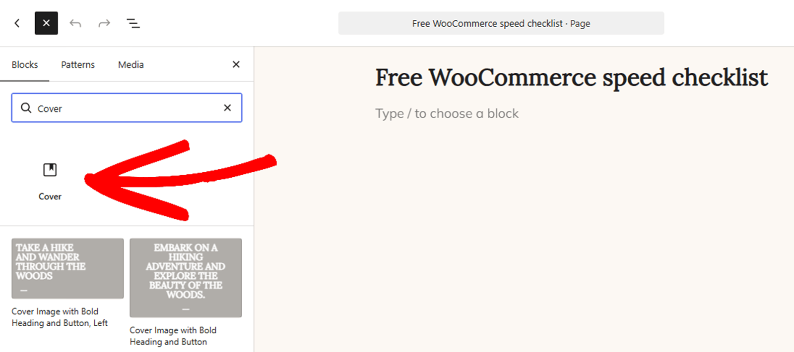
Click the Cover block to place it at the top of the page. The editor asks for a background, and you can either upload an image or pick a solid colour from the palette.
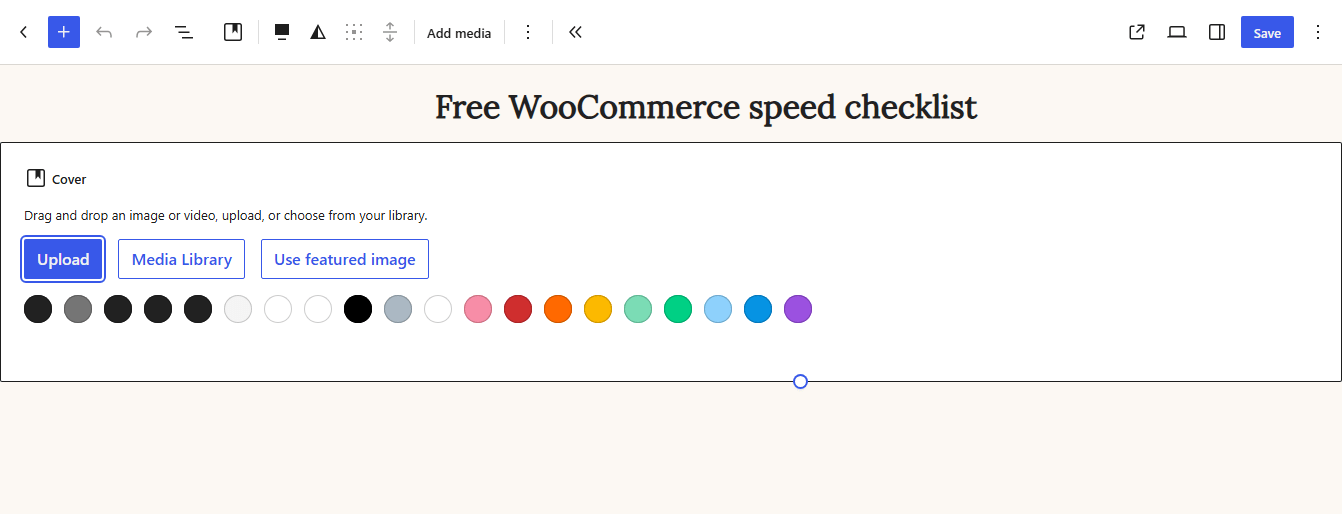
A solid colour is the safer choice on a first build, because background images look better in a mockup and cost more to load. A hero image is usually the single heaviest thing a landing page carries.
Now add a Heading block inside the cover and write the offer as a promise rather than a product name. A reader should be able to tell what they get without reading anything below it.
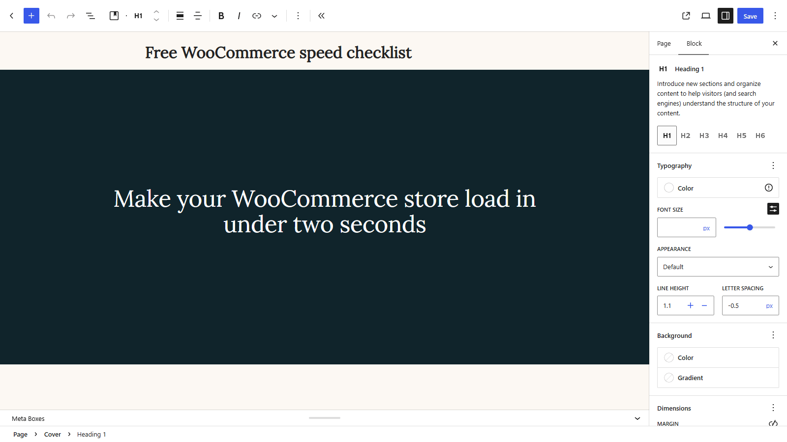
Set that heading to H1 in the block settings, because it is the page’s real title and nothing else on the page is competing for the role.
Add a Paragraph block underneath for one supporting sentence. One sentence, not three, and its job is to answer the obvious objection to the heading rather than to restate it.
Finish the hero with a Buttons block holding exactly one button.
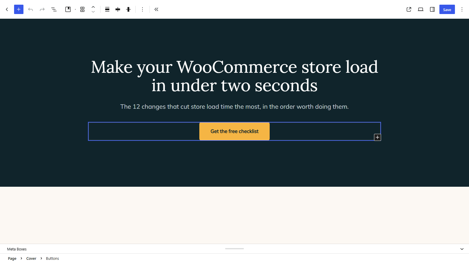
Two buttons in a hero is the most common mistake on this page, because a choice between two actions is slower than one action. If a second option genuinely exists, put it much further down.
Pro Tip
Write the button label as the outcome the reader gets. Get the free guide beats Submit, and the difference is measurable on a page that carries paid traffic.
Step 3: Add proof above the fold
Proof is what makes the offer believable, and it belongs higher on the page than most people put it. On a desktop screen the hero and the proof section are visible at the same time, on a phone they are not, and a phone is where most paid traffic lands.
Open the inserter again and switch to the Patterns tab, then look through the testimonial and review patterns your theme provides.
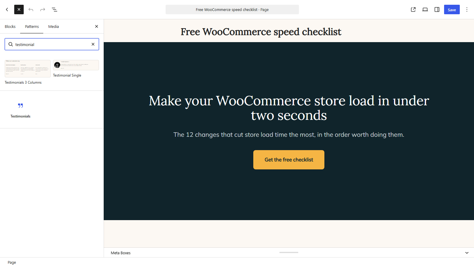
Click a pattern to insert it directly underneath the hero. Patterns arrive as ordinary blocks, so everything inside them stays editable.
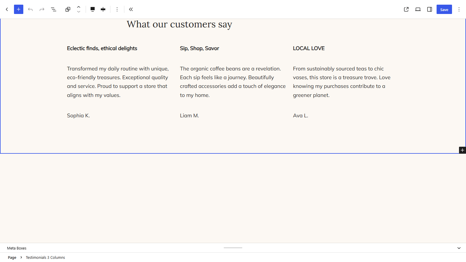
Replace the placeholder content with real quotes and real names, keeping only the ones that mention a concrete outcome. Two specific testimonials will outperform six vague ones, so cut rather than pad this section.
Add a small photo or logo beside each name where you have permission to use it. A round Image block about 50 pixels wide is enough, and a short bold line above each quote that names the result helps a skimming reader.
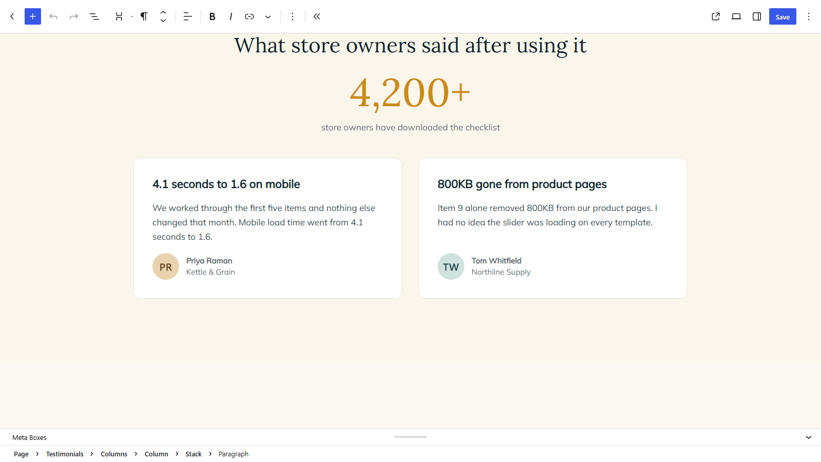
If you have a number worth showing, put it here as a single large figure in its own Heading block. A customer count, a measured result or a years-in-business figure does work that a paragraph of prose cannot.
Keep the whole section short, because proof exists to support the offer rather than to become the page. A proof section long enough to need its own scroll has started competing with the thing it is meant to support.
Step 4: Place the action with nothing competing
This section holds the action, and its job is to contain nothing else. Strip out any secondary link, related-posts block or row of social icons that your template drops in here.
If the action is a click, add a Buttons block below the proof section and select it to open its settings.
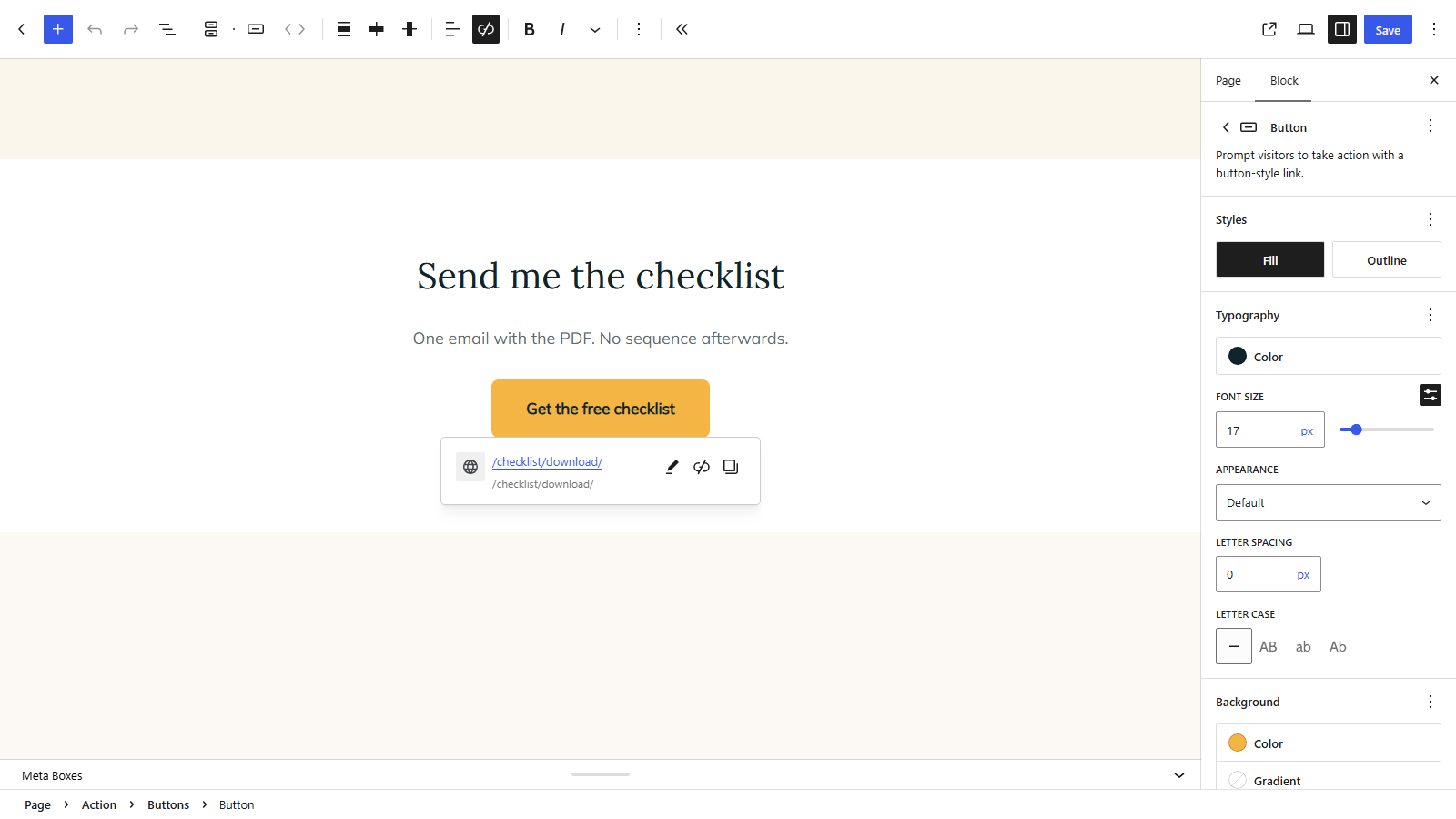
Click the link icon in the block toolbar and paste the destination URL, then press Enter to apply it.
Set the button’s width and padding so it is comfortable to hit on a phone. A button that needs a careful thumb is a button that gets missed, and the reader will not try twice.
If the action is a form instead, insert your form plugin’s block here and keep it to the fields you genuinely need. Every additional field costs completions, and on a first contact the email address is usually the only one that earns its place.
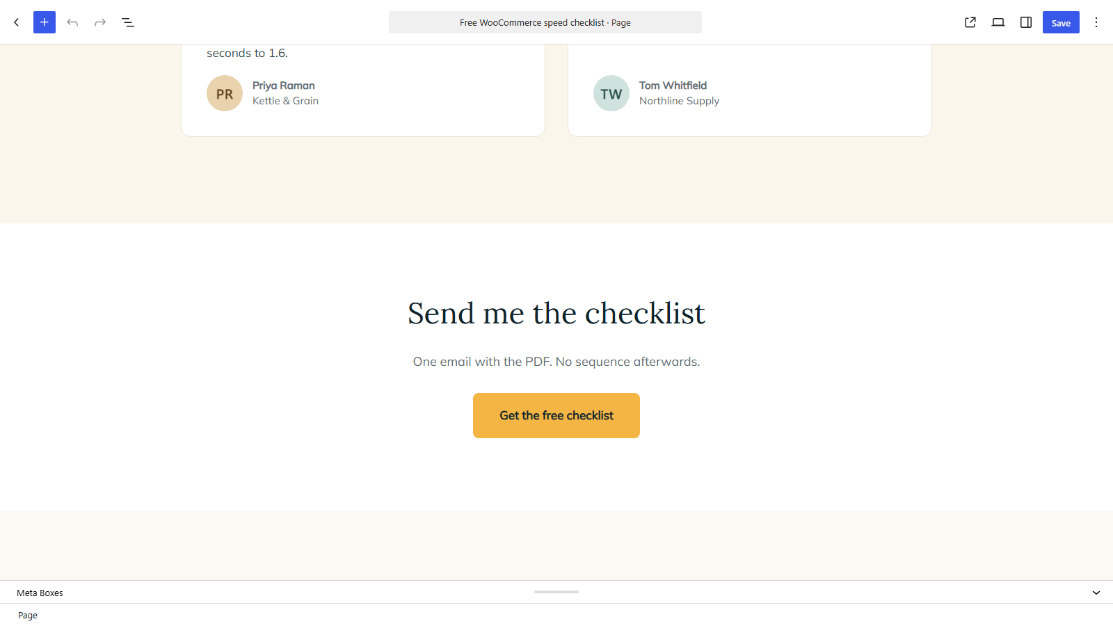
Whichever you use, check what sits immediately after it. A footer that reappears here, or a stray navigation block, will quietly undo the work done in Step 1.
Step 5: Repeat the call to action
A visitor who has scrolled to the bottom has read the whole page, and asking them to scroll back up to act loses some of them for no reason.
Add a second Buttons block near the end of the page, pointing at the same destination with the same label as the first one.
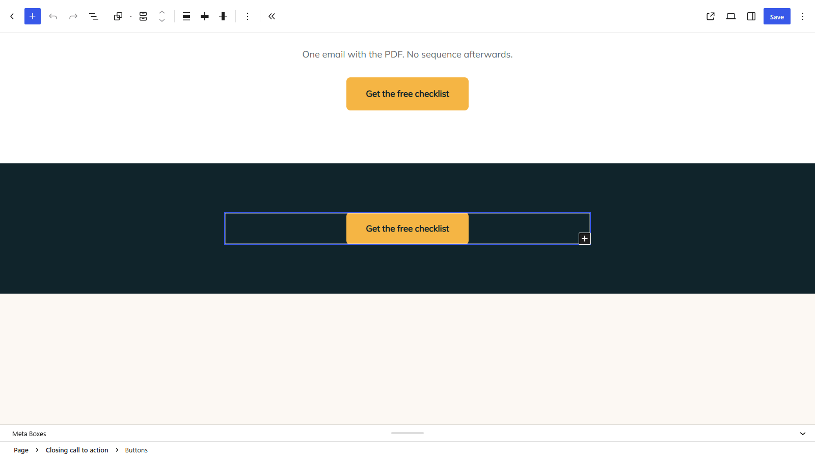
Consistency matters more than variety here, because two different labels for the same destination read as two different offers, and the reader has to work out which one they want.
Add one short line of text above it restating the offer, since anyone who reaches the bottom has been persuaded by the proof rather than the hero.
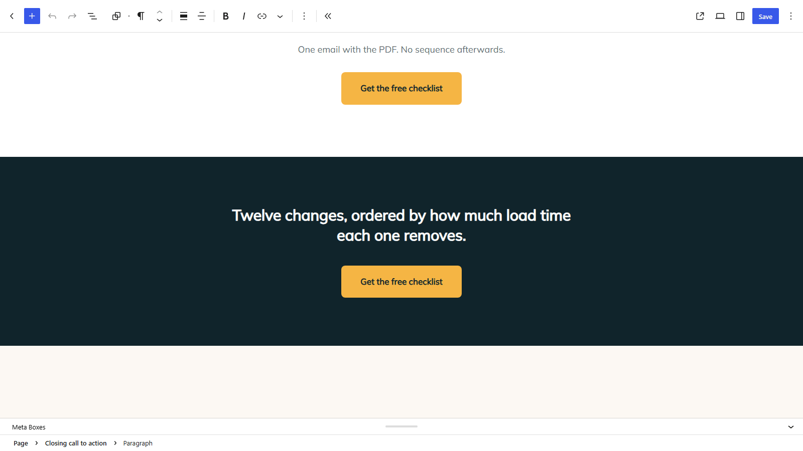
Now preview the page with Preview » Preview in new tab and read it end to end as a visitor would.
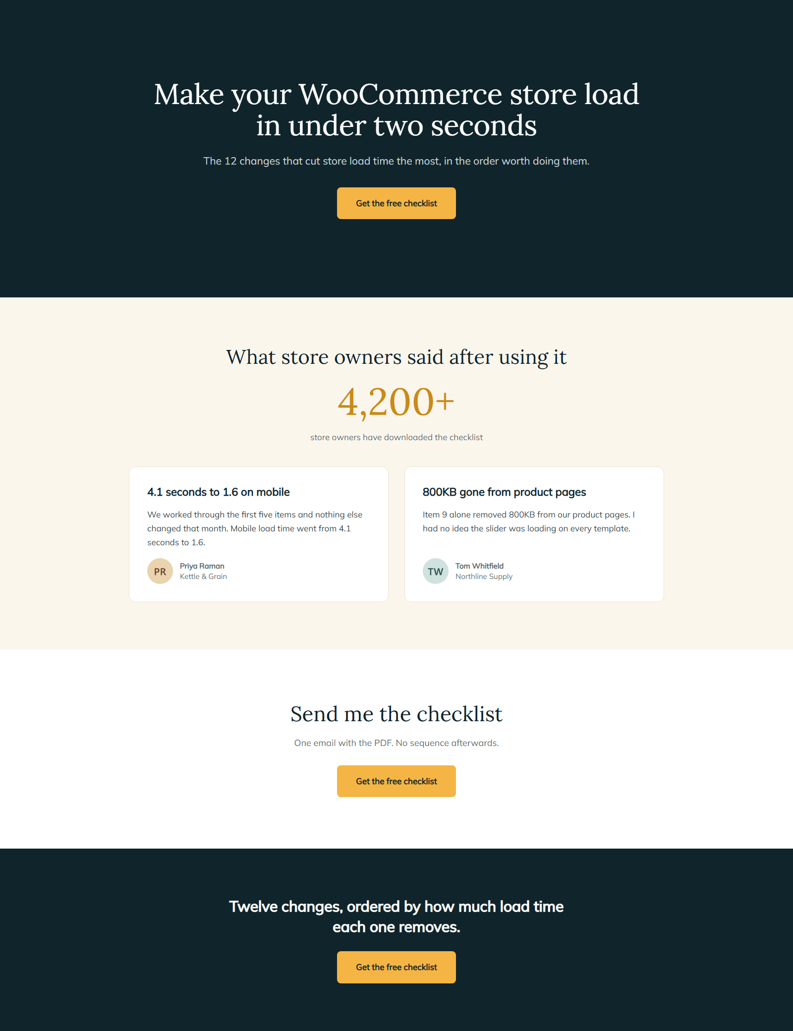
Three things are worth checking before you call it finished. The header and footer should be absent, the hero heading should make sense on its own, and nothing on the page should be clickable except your two buttons.
That is the whole build, and it did not need a plugin. One offer, one action, and no way off the page except forward.
What a builder adds, and what it costs you
A page builder does make the layout faster to produce, and it is only honest to say so. Drag and drop beats block settings panels for anyone who thinks visually, saved templates remove repeated work, and the responsive controls are more direct than the block editor’s.
The cost lands on the page weight, and it is not a small one. Builders load their own CSS and JavaScript on every page that uses them, and some load it site-wide. On a landing page that difference is not academic, because the page exists to convert paid clicks and a slower page converts fewer of them.
The practical position is to use the block editor until one of the four situations above actually applies to you, then buy the builder for those pages and keep the rest light. Sydney is a light theme that works with both the block editor and Elementor, which means the decision stays open rather than being made by your theme. Our WordPress themes page covers the rest of the range.
Check it before you spend on traffic
Four checks, in this order, before a single paid click arrives.
- Open the page on a real phone. Not a browser resize, an actual device. Check that the button is reachable with a thumb and that the proof section appears without a long scroll.
- Run a speed test on the page itself. Test the landing page URL rather than the homepage, since they are different pages with different weights.
- Submit the form or click the button. Confirm the submission arrives where you expect and that the thank-you state actually appears.
- Check the page in Site Health. Server-side problems show up here before they show up in your conversion rate.
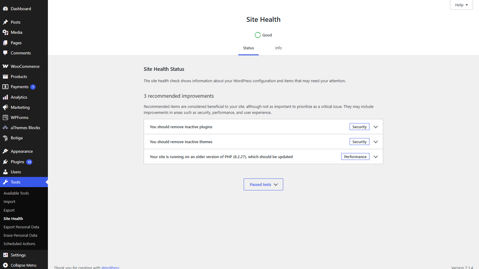
Run all four again after any change to the page, however small it looked. A page that converted last month can stop converting because a plugin update changed a form field, and the campaign spend will not pause itself while you find out.
If you would rather start from a theme built for this, our best landing page WordPress themes roundup covers the options.
FAQs about WordPress landing pages
Landing page questions come up constantly, especially around whether a plugin is needed. Here are direct answers to the common ones.
How do I create a landing page in WordPress?
Create a new page, set its template to a blank or full-width option so the header and footer disappear, then build a hero with one heading and one button, add a proof section, and repeat the call to action at the bottom, none of which requires a plugin.
Do I need a plugin to create a landing page?
You do not need one for a standard landing page. The block editor handles every part of it, and a builder is worth paying for only when you produce many pages, need precise positioning, hand editing to non-technical people, or want bundled conversion features.
What is the difference between a landing page and a home page?
A home page introduces the whole site and links to many destinations, while a landing page has one offer, one action and no navigation. A home page invites exploring, and a landing page deliberately prevents it.
How do I make a landing page without a page builder?
Use a blank page template to remove the header and footer, then build the page from core blocks. A Cover block for the hero, a pattern for the proof section, and Buttons blocks for the calls to action cover everything a typical campaign page needs.
How long should a landing page be?
Long enough to answer the objections that stop people acting, and no longer. A free download needs very little, and a high-priced offer needs proof, detail and reassurance, so let the price and the risk decide the length rather than a word count.
Final thoughts on WordPress landing pages
A page converts when it carries one offer and one action, and gives the reader no way out except forward. That rule decides more of the outcome than the tool you build it in, which is why this guide spent its first section on the rule and its longest section on a build that costs nothing.
Start in the block editor with a blank template and see how far it gets you. If you reach a month where you are building pages weekly and fighting the layout controls, that is the point where a builder earns its subscription, and not before.
What are you building your landing page for, and is a builder part of your stack already? Tell me in the comments below.